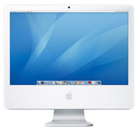
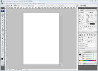
For my research I used the internet to look at film posters, film magazine covers and teaser trailers so that my 3 media products would end up looking realistic and professional, although I still needed originality for the group trailer. Our film trailer was an original idea and my magazine and teaser poster are promoting my original film idea. For my magazine, I needed to follow conventions to keep it looking realistic and professional. I was not allowed to copy images and other things from magazines, it all had to be 100% my very own original work, but I was allowed to make my magazine look like existing film magazines layout. I had chosen to make my magazine look like the Empire film magazine, as it had all the conventions that would be good to use in my magazine front cover. Conventions were also needed such as a barcode on magazine, release date, price and issue number. This was also done through using the internet by looking at and annotating pictures, watching and analysing trailers and reading and analysing text on posters and magazines. For research, the hardware I used was an Apple Mac computer and the software I used was Photo Impact for my magazine cover and poster. While using Photo Impact I found it easier and more professional to use. As I know I am not that good with Photoshop I didn’t want to waste time by trying to figure it out so I decided to use Photo Impact as it is similar and the magazine and poster looked very professional. I researched into conventions, which involved looking at and analysing real film posters, magazines and trailers over the internet.
I copied some real magazine covers and posters into PowerPoint and did a voice over explaining the codes and conventions that it had on it and what I could use to make my magazine and poster have the right conventions to make it look professional. I then saved them and copied them onto my blog.
For the teaser trailer I researched into conventions of teaser trailers. Planning for the trailer was mostly discussing with the other group members where, when and how to shoot the trailer. We created a list of actors, locations, props and costumes needed so that we were organised. I created a shot list time table as such, which told us which characters, props and location were needed for each shot. We also created a script for the characters in our teaser trailer. As a group we planned a name of the magazine and we decided to base our on ‘Film Flick’. Before I started work on it and I planned to use a temporary picture which I found on the internet so I could have a rough layout on what I wanted my magazine to look like once I had my own images. I planned the picture for my magazine to be a close up of the killer with a mask which was placed on the side of the front page. There was not much planning which needed to be done for my teaser poster because during my research I found out that there wasn’t much to a teaser poster as they are pretty basic. All I needed to do was use the conventions I had developed my knowledge of.
The conversion of technology such as the use of camera phones , ipods and new editing software, has helped me with audience expectations as my target audience are more prone to use such technologies which they can relate to. Using modern technology such as ipods and new mobile phones to record responses from my audience , has helped me to understand the connection between my target audience and my product.

No comments:
Post a Comment