Sunday 12 December 2010

Evaluation Question 4. - How did you use media technologies in the construction and research, planning and evaluation stages?

The media technologies I used were a Kodak 12.2 Megapixel Digital Camera, a Tripod and a Sony video camera. I used the Kodak 12.2 Megapixel to take pictures for the magazine and poster front cover because it has a larger amount of megapixels so that the quality of the pictures will come out better. Then I used the Sony video camera to film the trailer. I used a tripod whilst filming to keep our shots steady, where needed. To edit the trailer I used iMovie HD.

For my research I used the internet to look at film posters, film magazine covers and teaser trailers so that my 3 media products would end up looking realistic and professional, although I still needed originality for the group trailer. Our film trailer was an original idea and my magazine and teaser poster are promoting my original film idea. For my magazine, I needed to follow conventions to keep it looking realistic and professional. I was not allowed to copy images and other things from magazines, it all had to be 100% my very own original work, but I was allowed to make my magazine look like existing film magazines layout. I had chosen to make my magazine look like the Empire film magazine, as it had all the conventions that would be good to use in my magazine front cover. Conventions were also needed such as a barcode on magazine, release date, price and issue number. This was also done through using the internet by looking at and annotating pictures, watching and analysing trailers and reading and analysing text on posters and magazines. For research, the hardware I used was an Apple Mac computer and the software I used was Photo Impact for my magazine cover and poster. While using Photo Impact I found it easier and more professional to use. As I know I am not that good with Photoshop I didn’t want to waste time by trying to figure it out so I decided to use Photo Impact as it is similar and the magazine and poster looked very professional. I researched into conventions, which involved looking at and analysing real film posters, magazines and trailers over the internet.

I copied some real magazine covers and posters into PowerPoint and did a voice over explaining the codes and conventions that it had on it and what I could use to make my magazine and poster have the right conventions to make it look professional. I then saved them and copied them onto my blog.

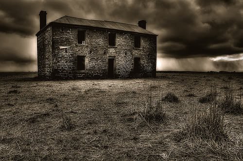
For the teaser trailer I researched into conventions of teaser trailers. Planning for the trailer was mostly discussing with the other group members where, when and how to shoot the trailer. We created a list of actors, locations, props and costumes needed so that we were organised. I created a shot list time table as such, which told us which characters, props and location were needed for each shot. We also created a script for the characters in our teaser trailer. As a group we planned a name of the magazine and we decided to base our on ‘Film Flick’. Before I started work on it and I planned to use a temporary picture which I found on the internet so I could have a rough layout on what I wanted my magazine to look like once I had my own images. I planned the picture for my magazine to be a close up of the killer with a mask which was placed on the side of the front page. There was not much planning which needed to be done for my teaser poster because during my research I found out that there wasn’t much to a teaser poster as they are pretty basic. All I needed to do was use the conventions I had developed my knowledge of.


The conversion of technology such as the use of camera phones , ipods and new editing software, has helped me with audience expectations as my target audience are more prone to use such technologies which they can relate to. Using modern technology such as ipods and new mobile phones to record responses from my audience , has helped me to understand the connection between my target audience and my product.

Friday 10 December 2010

Evaluation Question 3. - What have you learned from your audience feedback?

Audience feedback is very important when creating my main product and ancillary texts because it helps me understand who my target audience are and what things I need to include in my products and what things I need to change and adapt to make them perfect for my target audience.
Before making any decisions about my film I needed to identify with my target audience, I did this by making a video which I posted on my blog, in this video I asked people what they would like to see in a horror trailer. I decided to do a video and not a questionnaire because I feel it is more effective and different to typical audience feedback techniques. From these feedback videos I gathered the majority of information that I needed to fit my final trailer around what the people said in the video. Also the feedback from the videos I done regarding my horror trailer showed that my target audience prefer psychological horror rather than slasher horror, I tried to relate my horror trailer to this theme to gain more audience expectations.

I made a facebook fan page for my horror poster and magazine front cover and got audience feedback which is situated below, the audience feedback showed me exactly what my audience was looking for, and the feedback for my poster was really positive and the ideas we did. After showing the final ancillary text to my related target audience I found that all the ideas that was on the poster was what my target audience wanted to see and that showed that the video we done before we completed the poster was a good choice as it gave us an idea of what they wanted.


I also put the magazine front cover on the facebook page to get audience feedback and which is also situated below; the audience feedback was quite different to the one I gained for the poster and my target audience did give me some constructive criticism.
All the feedback that was given I agree with as I do feel that the magazine could have been simplified to make it easier to read, this would have been something I could have developed on to gain audience expectations.

As I got feedback from Facebook about my ancillary task, I decided to do a video feedback about my actual trailer.
Below is one of my classmates watching my trailer on the computer, which I videoed. After she had finish watching it , I asked her questions about what she had thought about the trailer.
The answer are below the video. The answers are not in a video format I wanted to show a variety of different techniques to blog.

Response:

Naresa: " I really enjoyed the trailer , I found that it had good use of rapid shots which made me want to carry on watching, also the use of music in the trailer was used very well as it fitted perfectly with each shot. The only criticm I would give this trailer is that some bits were quite confusing and I didnt understand the link, but that being said it is a teaser trailer and i did feel teased which made me want to know more about it but overall nice trailer , and I wouldnt mind seeing this in the cinema"

As I said above I wanted to use different styles of blogging my audience feedback. So now that I’ve used facebook (social networking site) and video feedback, I decided to use YouTube as a final technique to try and get good audience feedback. My YouTube feedback is situated below and it shows various comments of the trailer from my target audience.


I feel that YouTube commentary is very effective as since YouTube is video sharing network which people go on to view videos and share their views on it. So I decided to upload my video onto YouTube and send the URL Midnight Massacre YouTube URL to my target audience so they can give their feedback. I found this easy to do as most of my target audience have YouTube accounts so it was very efficent for them. The change in technology convergence has allowed people to view and share their videos and pictures which I also have learnt to do during my process of my production work.

I feel that having audience feedback has been a positive thing because it has helped me see my ancillary tasks and main product more clearly and I would have found difficult to see the evaluation without having other people’s inputs. I also feel that having audience feedback will help me understand even clearer what my target audience wanted from a poster, magazine cover and teaser trailer and to know that if I was to release these tasks as a real media product my target audience will be interested in the franchise.

Saturday 4 December 2010

2) How effective is the combination of your main product and ancillary text?


View more presentations from nessasary.
Overall , In my slideshare presentation I wrote about the link between my anciliary task and my main task. As written in my slideshow I wanted to show a distinct link because it was important for me to give my target audience what they expected which I outlined in my slideshow.
I wrote about what my intentions were for the main theme throughout my main task and my ancillary task. I wrote about why I decided upon this theme and what effect it would have on my final production.
My slide share consists of what I intended my final production and my ancillary task to be like, hopefully with a clear link between the two.

Friday 3 December 2010

1) In what ways does your media product use, develop or challenge forms and conventions of real media products.

Thursday 2 December 2010

Final Draft of Horror Trailer

Above is my FINAL production of my trailer. As seen below we did a 1st draft that we looked at and saw what was good about it and what was bad. After considering the pros and cons of the 1st draft , as a group we started to edit around the trailer, as this is the final production there is a big improvement and it hopefully meets the criteria of an teaser trailer.

Wednesday 1 December 2010

1st Draft of Final Production


Above is the 1st draft of my horror trailer as this is not the final production there will be some faults in it. I feel that doing this first draft has helped me understanding the mamy faults that are in the trailer , it allowed me to either cut down or add more clips to the trailer to make it more effective. Whilst looking at the 1st draft of my trailer I went back and did a little more research into other teaser trailers just so that some of my ideas can stick into my mind so I can apply them to my actual trailer. The trailers I looked at were - "Paranormal Activity" , "Twilight".

Tuesday 30 November 2010

Magazine Front Cover - Final


After careful consideration about our magazine front cover , as a group we sat down and looked through old magazine front covers such as "Empire", by looking at "Empire" we could establish a key theme between the main character infront of the magazine and the theme of the magazine background. This enabled us to see how the main character and the magazine layout both interlink, when anaylsing this magazine we came up with themes of our own and we tried to show a link between the magazine front cover and the trailer. After we planned out this we started sitting down and designing the front cover, whilst thinking about the strapline , title and picture we completed the final magazine front cover which is showned above...

Poster - Final

As you can see below we were choosing between two poster styles. However we have now decided to go with the second poster. We chose this poster because as we looked at other film posters such as "One missed call" and The "Uninvited" it showed us conventions such as the name of the starring character and a big main image. Through this I learnt that looking at other horror poster and what they typically include it will give me a good basis for making our poster to a good standard. The poster includes various things such as who it is starring, the title of the film and the certification. This in itself sets is above the other poster we were considering because it shows more about what the film includes rather than the colours it contains.
The final production of our poster is situated above...

Saturday 20 November 2010

Poster Choices

After taking pictures for our poster , we narrowed it down to one picture but two poster styles.
We done two poster styles to show the choices we were considering. Below are the two choices we were considering. The first picture was our first style choice, we decided to do this poster like this because we wanted it to contain everything that a usual poster has included in the movie rating e.g. 5 stars. However the poster did look a bit to busy and therefore you couldnt really focus on the main image which should be the main attraction. So we therefore did another poster , which is the 2nd picture, this one was done in much more detail but it was subtle and included what we thought would attract the audience and be rated much more as a poster than the other one.

*Click on the pictures to enlarge it - to view it better*

Thursday 18 November 2010

Photoshoot Still Shots

As we are assigned to do a magazine front cover and and poster we decided to take a lot of pictures to give us a variety of shots. This gave us a wide range pictures to choose from and therefore we could see what our audience thought of our pictures and we could pick what pictures were more suited.

Above is a slide show to show the extra pictures that we took while shooting our photoshoot for the magazine front cover and poster. After looking at all the pictures we narrowed down the selected few.

Wednesday 17 November 2010

Film Production Still Shots


Above is the slide show that I put together showing still shots of our filiming process. I decided to take still shots so that any clips we do not put into our trailer we can show through the still images. Although some of the pictures above are not ones we used in our trailer or for our magazine or poster front cover , I thought it would be significant to put it in the slideshow to show the decision we made as a group on what images to add to our final production.

Thursday 11 November 2010

Start of Production - Magazine Front Cover , Poster and Trailer

After doing my research and planning *which is situated below* it was time for me to start doing my production work which consists of 'Magazine Front Cover' , 'Poster' and 'Film Trailer'. So all the above posts will have my still shots from filiming , audience feedback and the final productions of my coursework. After all that I learnt from Research and Planning hopefully will help me get a better understanding of what my final production should include, from all the class work and group work to individual work, I have grasped what is needed to make a successful trailer and poster.

Wednesday 10 November 2010

Evaluation of Research & Planning

View more presentations from nessasary.

Above is a presentation I made on powerpoint and then put onto slideshare to discuss the process of what I have learnt through doing my research and planning. It answers questions about what I have learnt throughout this process. Through doing this presentation I could focus on all that I tried to do to make my final production have all the key concept it's suppose to have , this was enabled through the target audience profile , research into horror genre and planning my horror trailer concept I feel that it has given me a good basis to complete my final production to a good standard.

Friday 22 October 2010

The 5 S's - Storyboarding

Above is a Slide presentation of my groups storyboard. When doing the story board we decided to plan it out how we would visually like it to come across in the final production. So the Slide presentation shows the stages of which we wanted each scene to come out. Next to each scene we wrote how long we wanted it to last for and what type of angle we wanted it to be shot.

Wednesday 20 October 2010

The 5 S's - Schedule

After prepping for planning our trailer , we then sat down and decided to work out what days would be best for one another to get together to film , as we wouldn't want anyone to miss any days of filming. So from then we planned out what days we would be best to get as much done as possible. We firstly sorted out a day which we should by the costumes and the masks and all the props needed for the trailer. After sorting this out we then had a clear schedule of when we need to film and what times would be best to give that 'horror' effect (e.g after 8 ,when its dark and foggy). So after careful consideration of everyone in the group needs we planned when and where we would like to film and on what days would be best , this will ensure us that the film will be done to the best of our ability.

Monday 18 October 2010

The 5 S's - Stock Characters

We discuss as a group how many people we would like use in our trailer. We decided to keep the characters quite minimal we felt the use of props & locations would speak for themselves.
The only form of characters we are using with speech is a reporter. This reporter is used to inform the audience this killing has been happening over a period of time & the people in the area are aware of the situation. We are going to use props to insinuate that a murder has happened or is about to. We are going to use a 'random' victim to just emphasise the amount of killings. Our main victim we are focusing on will be a girl, we want her to be shown as vulnerable because when we are challenging our stereotype the killer is going to be shown as very strong & the contrast between victim & killer will be emphasised.

Victims tend to be very vulnerable in horror films. The killer will be very different from our usual killers we see in films. Our killer is going to be femine she will wear a long cloak with red heels, red lipstick & long hair. She will be wearing a femine mask to keep the mystery alive. Masks tend to be used in films to do the exact same thing and I feel it keeps the story more alive when you dont know who it is. For example in the film "When a stranger calls" the man was not wearing a mask but his face was never revealed to the camera. Every other aspect of him was apart from his face & to me as the audience I felt this kept the suspense and intrigued me more.

Sunday 17 October 2010

The 5 S's - Shot List

As a group we sat down and decided on what shots were going to go 1st and how we were going to organise it in relation to filming. After careful planning we decided how we would like the shots to go and below is the organised shot list.
Before going into production it is vital to plan out how the movie is going to be shot. Directors always have their own planned out shot list for planning out the movies shot selections.

Above is the picture of our shot list (click on the picture , then click again to enlarge)

Saturday 16 October 2010

The 5 S's - Script

In our trailer there will be hardly and talking as we would like to keep it snappy and attracting to the audience. So because of this decision we made we decided to only let the reporter in our trailer speak about the 'killings' that will take place. So therefore the script below is only written about the reporter - which will contain overlapping voices of other reporters to create a sinster effect.

Reporter 1: (After the Dark room shot) * Woman's Voice* " Im standing just infront another YET gruesome murder. Last night another murder was committed at 11.54pm. A girl was brutly killed, she was thought to be ...
Reporter 2- *Speaking over* *Womans voice* "Another murder at 11.54pm another girl was kille left with no identification of who she is , she was thought to be...
Reporter 3- *Speaking over* : A woman was walking her dog when she found a girl covered in blood , it seemed that she been left here for quite some time , she was thought to be...
*VOICES ALL TOGETHER* : "Some are saying this is a massacre!!!!!"


(Example of a script)

Friday 15 October 2010

Certification for Midnight Massacre 2

As a group we decided to aim our film at 15 years and over. We decided to do this because we feel that we will be covering a wider audience base , as that is the age that they are more prone to watch horror films. Also because our film will not contain any explict scenes or hardcore violence will feel it would be a suitable age to set it for.
Below is a classifcation outline of what it means for your film is your plan on aiming it and 15years and above.

BBFC 15 CERTIFICATION RULES:
These categories are awarded where the material is suitable, in general, only for those aged 15 and over. Works classified at these categories may upset children under 15 or contain material which many parents will find unsuitable for them.
The ‘15’ category exists only for cinema films. No one younger than 15 may see a ‘15’ film in a cinema unless accompanied by an adult, and films classified ‘15’ are not recommended for a child below that age. An adult may take a younger child if, in their judgement, the film is suitable for that particular child. In such circumstances, responsibility for allowing a child under 15 to view lies with the accompanying adult.
The ‘15’ category exists only for video works. No one younger than 15 may rent or buy a ‘15’ rated video work.

Thursday 14 October 2010

Risk Assessment - Filming

When conducting a risk assessment, consider all the likely hazards, who may be harmed, property which may be damaged, and the controls already in place. Then, for each likely hazard, bearing in mind the controls already in place, record the ‘risk assessment’ level which can be seen on the following table. The further actions to be considered will be determined by the level of risk assessment.

(Click on the picture to enlarge it , to view the risk assessment)

Wednesday 13 October 2010

Midnight Massacre 2 - The Synopsis

After researching plot lines / synopsis we were able to come together and discuss how we would like to write our synopsis so it doesnt give anything away , like most slasher horror films do.
Typical synopsis consists of killer always looking for a victim , or it starts of all 'jolly' then it hits rock bottom and someone gets killed - this was seen in 'Texas Chainsaw Massacre'. However in
'Wrong Turn' the synopsis was different , it was written straight from when someone got killed then it explains the rest of the plotline which then shows it all 'jolly'. This is something you wouldn't expect as it is a horror movie. So after researching all of this we knew that we had to make ours stand out but still keep it the conventions of a horror movie. Below is our OWN written synopsis of our film.

Midnight Massacre 2 - The Return of the MASKCARADE:
Returning to finish off what she started , The Midnight Masscare killer is back , but her final victim is proving to be harder than she thought.
Anne Hisburg is a returning sociopath , with a undiscovered moral behind her killings but what could she really be hiding? She has set out to kill off her victims one by one as soon as midnight strikes. Her last but by no means least victim proves to be more than she can handle , after hunting her down for a year she finally gets close enough to finish what she started , but with her prey being a more complicated case , there are unexpected consequences for her and her victim. Who says the killer can't be the victim?

Tuesday 12 October 2010

Our Title - Midnight Massacre 2 - The Return of the MASKcarade

The title of our film is called 'Midnight Massacre 2 - The Return of the MASKcarade'.
We chose this film title because it gives it a very well known slasher theme. Other slasher films base there themes on specific dates or times , films like 'Friday the 13th' or ' I Know What You Did Last Summer'. By looking at these films it gave us the idea that by making our title link to previous films in the way they have these specific dates or times , can trigger audience expectations of what they would like to see in slasher horror.
When deciding on the name 'Midnight Massacre 2 - The Return of the MASKcarade'. We thought it was really clever as it shows that the whole aspect of the film relates to something happening at midnight. Also by looking at such films like 'Texas Chainsaw Massacre' , it gave us the idea that using the word 'massacre' in our film shows that there has been a numerous amount of killings which instinctively relates to slasher horrors.
The idea of 'MASKcarade' is the fact that the killer is not revealed throughout the film which is typically what happens in slasher horrors such as 'Scream'. We cleverly used 'MASKcarade' in one word because 'masquerade' is an event which participants attend a party in costume wearing masks. However we decided to spell it as 'MASKcarade' to create a play on words.

Monday 11 October 2010

Planning Ideas - Our Concept


After a brief introduction to our coursework and my research into what horror is and what horror trailers do to make themselves noticeable to the horror genre, I and my group decided to start jotting down ideas of what type of horror film we'd like to produce, the name and the location we should film it at. Above are rough pictures of our ideas that we put together in class. Jotting down these ideas helped us plan foward what and when we'd like to start planning properly , also allows us to converse together as a group to pitch ideas to one another.

Thursday 7 October 2010

Research Into Location - Relating to Our Concept


When researching into locations that slasher horror films use we notice a consistant pattern of a dark mysterious HOUSE in the middle of no where , this was seen in 'The Strangers' , or either woods which is very sterotypical as a horror location, this was seen in the film ' The Blair Witch Project' , there are many typical locations that are used in horror films for example a school when watching a teen based horror movie such as 'Prom Night'.

However there was one film that stood out from the rest that caught our eye which was 'Scream' , as 'Scream' was set in the cinema and we find that this a non-typical idea , something we like tob go with. So by weighing out all the locations that slasher horror films have we decided to not use any typical locations but to mix and match with locations.

Wednesday 6 October 2010

Research into Props/Location - Relating to Our Concept


During a lesson my group and I went out to find props we would like to use in our trailer we tried to find props that will connect with the name of our trailer. Since our trailer is called 'Midnight Massacre 2' we decided to use a mask as the main prop in the trailer. As masks are iconic in horror films such as 'Friday 13th , Scream etc , we decided to make it more of a feminine mask so we can go against the typical sterotype of it being a man behind the mask.

Also with the clothes used in slasher horror films , it tends to be rugged and wrecked. Once again we just want to go against that whole sterotype and make the custome of our killer dark yet classy , still giving you the sense of slasher horror but with a twist. When discussing what props we would like to use for our trailer we had to narrow down a number of props to certain props that will make our trailer stand out from the rest.

We decided to use a clock in our trailer to symbolise time ticking away towards midnight , to also show that time is running out. We also decided to use a red pen , red symoblises blood which we were going to use to circle the pictures we are going to use in our trailer - to represent a target. To get the whole horror concept on point , we decided to use many pictures in the trailer to emphasise the killer's psychopathic ways. We decided to use these pictures because since we are only doing a short trailer we wanted the audience to get a glimpse of what are plans are.


Monday 4 October 2010

Research into Magazine Front Covers

Below are the two front covers we looked at , we used a voice over to talk about the covers and what we saw in it that is going to relate to our own movie front cover.

(Click on the video to hear us speak about the magazines , in relation to our trailer 'Midnight Massacre 2 - The Return of the MASKcarade)

(Click on the link to view more examples of film magazine front covers) >>>

Thursday 30 September 2010

Research Into Teaser Trailers

A teaser trailer is a short version of a movie trailer which is designed to draw the interest of the audience, getting them excited about an upcoming film. They are typically released months in advance, sometimes as much as 18 months before the expected release date of the film, and they are used to build anticipation and curiosity about the films they advertise. a teaser trailer lasts between half a minute and a minute. It may include footage from the film, often in a rough stage, since the film has not been completed, or it may develop new source of material. In some cases, a teaser trailer is simply an edited version of a regular movie trailer.

From a marketing perspective, the teaser trailer is a brilliant tool. The brief advertisement is usually not terribly costly to make or expensive to air on television, and it can suck viewers in, getting people hyped up about a movie months before it is released.

From researching about teaser trailers . it gave me alot to look at for when I do my trailer for my horror movie. The trailer above has roughly the same time length that our trailer will be and and we would like our trailer to be shown months in advance (since it is a teaser trailer) and the trailer above relates to exactly how we would like our trailer to end up.

Other examples of teaser trailers >> click on the link to watch>>>

Toy Story 3 - Teaser Trailer

Social Network - Teaser Trailer

Tuesday 28 September 2010

Applying Recognisable Conventions of Trailers

In order to apply the recognisable conventions of trailers , in groups. we came up with the idea about how to market and promote film called ' Bloodshed High'.
When we were assigned this task to conduct a presentation (which is below) about how we would market the trailer for the film 'Bloodshed High'. As a group we storyboarded our trailer ideas and put our presentation together to try and market our trailer idea.


As a group we decided to spend a fair amount of time discussing how we would go about pitching our idea. We decided to go against the typical horror genre and we decided to add some comedy into it. We decided this because most horror films mainly focus on the kiling and dark scenes. However we decided to do a Scary Movie type film , so we decided to add some comedy to go against typical horror sterotypes. We decided to set the trailer in cabin/forest type place in which most of the trailer will be set , so it doesnt give away any other ideas we were planning - what we like to call a teaser trailer. This location goes well with our storyline , however no one will know what our storyline is. We decided to use soundtracks from well known horror/thriller films so it is iconic to the audience who watches it.

Also because many well known films have a USP , we decided to make our USP the fact that our film is ab mixture bewteen comedy and horror. As a group we decided to use well known actors to feature in our movie , preferably ones that have featured in previous horror movies. One actor we decided to go with is Megan Good , we decided to use her because she was in a well known horror film 'One Missed Call' and she will be recognizable to certain audiences , also she her presence in the film will automatically bring her fans to watch 'Bloodshed High'.


When it was time to discuss our soundtrack for our trailer , my group decided to go with a well known track that was used in the well known film 'Twilight' by Lupe Fiscao called Solar Midnite. We decided to use this because the soundtrack has an good strong beat that creates tension when hearing it.

After planning our presentation for our trailer and actually doing I learnt alot of things from it. I learnt that trailer are not movies. By this I mean that when advertising a trailer we shouldnt give the whole storyline away in it , this goes against the whole concept of what we known as a 'Teaser Trailer'. Also I learnt that audience expectations and production companies are key and vital. It is always good to give the audience what they want in terms of a good movie , this will provide the audience with a good basis to come and watch the movie. Also a well known production company at the start of the film is very good in getting certain audience members to watch the film , as come audiences like to know who is sponsering the film (production company) before they watch it. After learning all these key points from planning and doing our presentation , it is easier for me to know how to apply these when it comes to my actual production.

Wednesday 22 September 2010

Audience Feedback - Horror Horror Horror!

I and my group went out and around school to interview people on their thoughts of horror and what they would like to see or what they would expect to see. Below are 3 videos which show 2 students and a teacher talking about their experiences of horror films , so we can see what is typical and try and challenge conventions.


From recording these videos asnd hearing the feedback , it gave I and my group and vivid idea about what people expect to see in a horror film. The feedback was interesting as it varied from each person we talked to and gave us a better idea of what we could do to make sure our horror trailer had all the conventions people expect to see.

Tuesday 21 September 2010

Audience Feedback - What Makes You Come and See a Film?

To get a better understanding of what makes people want to watch films , whether it be horror, comdey or a soppy rom-com , I decided to go out of my way to go up to people and ask them what makes them want to watch films - All the feedback is recorded below.


Audience Profile:
Name: Harry-Anne Stokes
Age: 17
Occupation: Student
- I decided to ask Harry-Anne what she feels makes her intrigued to watch a film and as seen above the video states that the trailer is the main part in her decision to make her want to go out of her way to watch a film.


Audience Profile:
Name: Asma
Age : 16
Occupation: Student
- I asked Asma what she found more appealing when deciding to watch a film the poster or the trailer , her answer is recording in the video above.


Audience Profile:
Name: Rema
Age: 16
Occupation: Student
- I asked Rema what she found more appealing when deciding to watch a film the poster or the trailer , her answer is recording in the video above.

Monday 20 September 2010

Research Into Horror Posters

The visual and written code used in this poster is the sword and the mask. This shows that the man is trying to hide his appearances and at the same time trying to protect himself Рthis is a clich̩ horror film, which relates to audience, which tends to be young people.
The name ‘Friday The 13th’ is a type iconography because instinctively when you see the name you know it’s a horror movie.
A catching slogan to describe the film more would be ideal in this poster, as most horror film poster tend to have this. This could be a way to go against typical horror clichés .This poster creates enigma through the mask as the man is full covered up and we do not now who or what he is. The phrase ‘Welcome to Crystal Lake’ makes you wonder what goes on in crystal lake and why the man is there – this is another sense of enigma
The film producers are trying to create a sense of danger and equilibrium by showing a man in the middle of a forest with a mask and a weapon in his hands, this creates a sense of fantasy in which you wouldn’t see in real life.
You can instinctively tell that this film belongs to a horror genre, this is shown through the iconography of the masked man and the setting around him.

The visual written code used in this poster is woods on the poster. This shows that it is set in a misty place and also the written codes on the poster gives an insight into the storyline and what to expect , rather than having to guess for yourself.The poster provides more information than a normal poster would or should provide. This poster has a picture, title all the normal things a poster should have. However it does have a contain a mini synopsis which most films do not have, this could make the poster stand out more.
I would have expected to see a release date on the poster, most poster have a realise date. Maybe this was done to keep the audience in suspense or to make the audience search for when it’s actually realised, this could show that the audience actually wants to watch it since they went out of their way to search for it. This poster creates enigma through not having a main picture, this make you as an audience rely on other things like the title and words to find out what the film is about. The film producers are trying to create a sense of danger and equilibrium by showing the misty black and white forest, this is something you wouldn’t see in real life, and it gives you that sense of fantasy. Once again instinctively you would know this film belongs to a horror genre. It has all the conventions that a horror poster should have.

The visual and written codes used in this poster is the lift that is the centre of the picture, also the upside crucifies. This shows what kind of film it is going to be my looking at the visual iconography.

The visual image in this poster which is the lift and the upside crucifies, gives us the information about what the film contains and an idea of who would be in it e.g. devil related people
For a typical horror poster, this poster has all the conventions of a poster so all the information is there, however there is no picture to show us a concrete idea, so it relies on guessing.
This poster creates enigma because as i said before , it has no picture to show us who is in it and what there role is in the film.

The film procedures are trying to create a sense of danger and equilibrium by showing a closed lift with a red line in the middle of it, you do not know who is in the lift and what will happen if they come out. So the equilibrium comes from that.

From looking at these poster , it has help me understand what a typical horror poster consist of , and whether I'd like to go with the typical horror poster style or go against it. I now know what needs to be done on our poster to draw our target audience in without giving too much away of the story line.